Hi, I'm Moritz.
I'm a software developer and consultant with a focus on user experience.
In my spare time, I work as an audio engineer, particularly in musical theater and concerts.
- Germany
- contact@mahringer.dev
Web applications
Before joining my current employer, I developed business software and occasionally did contract work as a freelancer. My main product was a SaaS time tracking and billing software for small IT agencies. I have also worked on other web- and some desktop apps.
My preferred stack for greenfield projects is React, GraphQL/Relay, TypeScript, Node, Tailwind, and Docker. My apps are often data-intensive, and I developed a robust skillset surrounding performance optimization, including a sensibility for DOM node count and optimizing React rerenders. Safari is my primary browser, so I know about many cross-browser quirks, especially because I love to build highly themed sites, which often stress standards compliance. My skill set also includes performance optimizations for PostgreSQL queries, such as improving nested common table expressions and join order.
I use end-to-end testing extensively because it gives me confidence for large refactors and allows me to use automatic dependency updates, which might be the best quality-of-life improvement for developers. My newer projects use Playwright or Cypress, but I also maintain an old Selenium-based test suite.
Tooling and parsers
I developed a parser and optimizer for XFA FormCalc, a semi-standardized language for creating PDF documents. This work involved reverse engineering the language and implementing an LR(1) parser and optimizer written in Rust. The optimizer does basic steps such as constant folding and dead code elimination but is tuned for speed since it needs to parse gigabytes of scripts on each execution.
I have experience implementing plugins for front-end tooling. To optimize the rendering performance of an app with many icons in a data grid, I wrote a Babel transform to replace FontAwesome React icon components with their corresponding web font counterparts. I also developed a Webpack loader for responsive images.
Another example of tooling I wrote is a utility for managing GraphQL persisted queries, including breaking change detection in older app versions.
Design work
Business software must present a lot of data and allow for high productivity, often sacrificing intuitive usability and aesthetic concerns. Employees are more productive with well-designed, aesthetically pleasing, and intuitive software. Gray button wastelands make productivity software unnecessarily tedious. Thus, my apps are filled with tiny, unobtrusive details.
For example, Users primarily interact with my time-tracking software through a stopwatch widget, which they use countless times a day. Frequently used components should be subtle with their animations, so the icon only lightly borrows from its real-world counterpart by slightly pushing down on hover and fully pushing down on click. Additionally, the clock hands show the elapsed time.
This demo uses a placeholder instead of the actual inline editor, which is fine-tuned for all relevant details. The clock is also sped-up instead of real-time.
Theming and animation
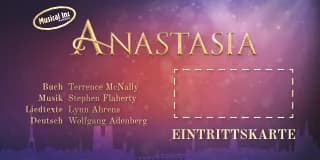
For the 2024 production of "Anastasia" by the Musical Inc. e.V., I built a highly themed ticket shop front-end, from which I want to highlight the ticket envelope animation and frame.
As a fun representation of the product patrons will receive, there's an envelope with tickets right next to the cart. When the user selects a date, the envelope opens. Each selected ticket immediately animates in. At checkout, it closes, and the customer's name and address are added.
The initial prototype used framer-motion but needed to be more flexible and performant. The production version uses XState to orchestrate the multi-step animations. It animates five virtual tickets like a ring buffer to reduce GPU memory allocation. Turning and opening the envelope is one logical operation, but the tickets must be tucked in before closing the lid and can only animate out after the lid is opened again. Using a state machine to drive transition parameters made it easy to implement these timelines. If desired, logical operations could also be aborted if the target state changes while animating.
The actual graphic is built entirely using CSS 3D transforms, and CSS transitions handle all animations.

Moritz Mahringer
St. Johanner Straße 104
55576 Sprendlingen


This demo is manually scaled to twice the size it's designed for. Since the route controls envelope orientation, it doesn't normally need to open before animating tickets, but it can do so anyway.
A prominent part of the print design I also created is an ornamented frame with the corners flipped to the inside and a frosted-glass aesthetic. Print layouts and social media posts use the frame to highlight the main content. The darkened and blurred backdrop is vital to ensure the text is readable against the bright and colorful background texture. Recreating the component for the web was surprisingly challenging.
The corners are a progressive enhancement and not visible on small screens.
Since the component uses a blurred backdrop over a globally fixed background, it
can't easily use prerendered images and has to be accurately masked instead.
Using clip-path proved to be a dead-end since it can only create
rounded shapes using SVG paths, which in turn can't have an absolute size.
Absolute sizing is vital to avoid stretching the circular corners and keep
aesthetic proportions. The ideal solution would have been
mask-border, which supports the same
nine-slicing as border-image. Unfortunately,
it hasn't shipped in Firefox yet. Ultimately, I solved the issue using four
linear gradients as a mask.
Interestingly, the same issue cropped up while creating the grunge border for
this demo, and since it uses a texture and not just a simple shape, I had to
find a new solution. While Firefox doesn't support mask-border,
it does support element(#id) as a CSS image, so it now uses
an invisible element as a luminance mask. That element uses the same nine-slice
technique but with border-image.
Open source, writing, and communication
I created a web service around the HTML-to-PDF library WeasyPrint, featuring extensive documentation.
Another example of technical writing is my unofficial documentation page for the Behringer WING audio mixing console. A good example would be this article about global audio settings.
I always strive to write high-quality issues, questions, or answers. I'm also active on StackOverflow (1.4k 19 30).
Teamwork and consulting
When I worked for my old university's administration, I coordinated the technical aspects of an interdepartmental project to add cryptographic verification to official printed documents. Translating between technical and non-technical staff across different teams and getting everyone aligned on incremental goals was refreshing compared to pure implementation work.
Hobbies
In my spare time, I work as an audio engineer. I focus primarily on musical theater but also do larger bands and studio work. Additionally, I recently started working on sound design for indie films.
In addition to my paid work as an audio engineer, I have volunteered at the nonprofit theater company Musical Inc. e.V. since 2019. I joined the group to lead the tech team and, as of last year, lead the whole nonprofit, which has roughly 250 members, of whom about 90 are active for a given production. My involvement had a significant impact on my communication style and effectiveness.
Kind regards und liebe Grüße,
Moritz